By Yamuno Team
19 Sep 2025
4 min read
We're thrilled to announce the launch of Charts - Reports and Graphs for Jira Dashboard! This powerful new app transforms your Jira data into beautiful, interactive visualizations that bring clarity to your project insights and team performance.
Visualize your Jira issues with stunning chart types including:
Make your charts truly yours with comprehensive branding options:
Choose exactly what data to visualize:
Gain deeper insights with flexible grouping options:
Charts for Jira Dashboard solves the challenge of making sense of complex Jira data. Instead of struggling with spreadsheets or static reports, you get:
Ready to transform your Jira data into actionable insights?
👉 Install Charts for Jira Dashboard
Explore our comprehensive documentation to master all features:
👉 Charts for Jira Dashboard Documentation
Need help getting started? Our support team is here to assist you with setup and best practices.
Transform scattered Jira data into clear, actionable insights. Whether you're tracking sprint progress, analyzing team performance, or presenting to stakeholders, Charts for Jira Dashboard gives you the tools to tell your data's story.
Start creating beautiful charts today!
Have questions or feedback? We'd love to hear from you via our support portal. Your input helps us continue improving our apps to better serve your team's needs.
Featured App
Visualize Jira issues with interactive, customizable charts and tables
Get product updates and tips straight to your inbox.
No spam, ever.

Confluence's native PDF export has no cover page. Here's how to add a professional title page — with your logo, accent color, and subtitle — to any Confluence PDF export.
Read more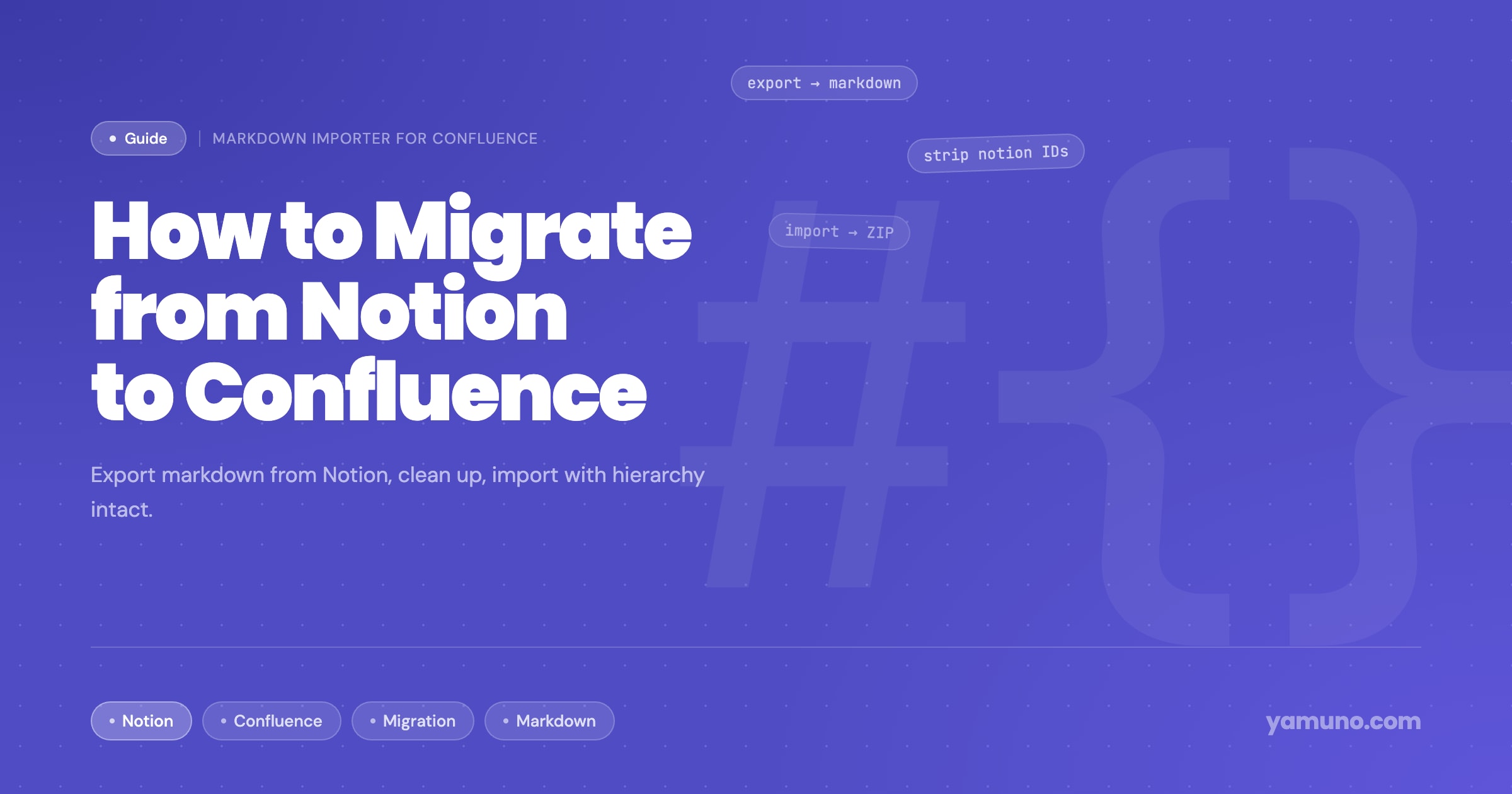
Switching from Notion to Confluence? Here's how to export your Notion pages to markdown and import them into Confluence without losing formatting, structure, or attachments.
Read more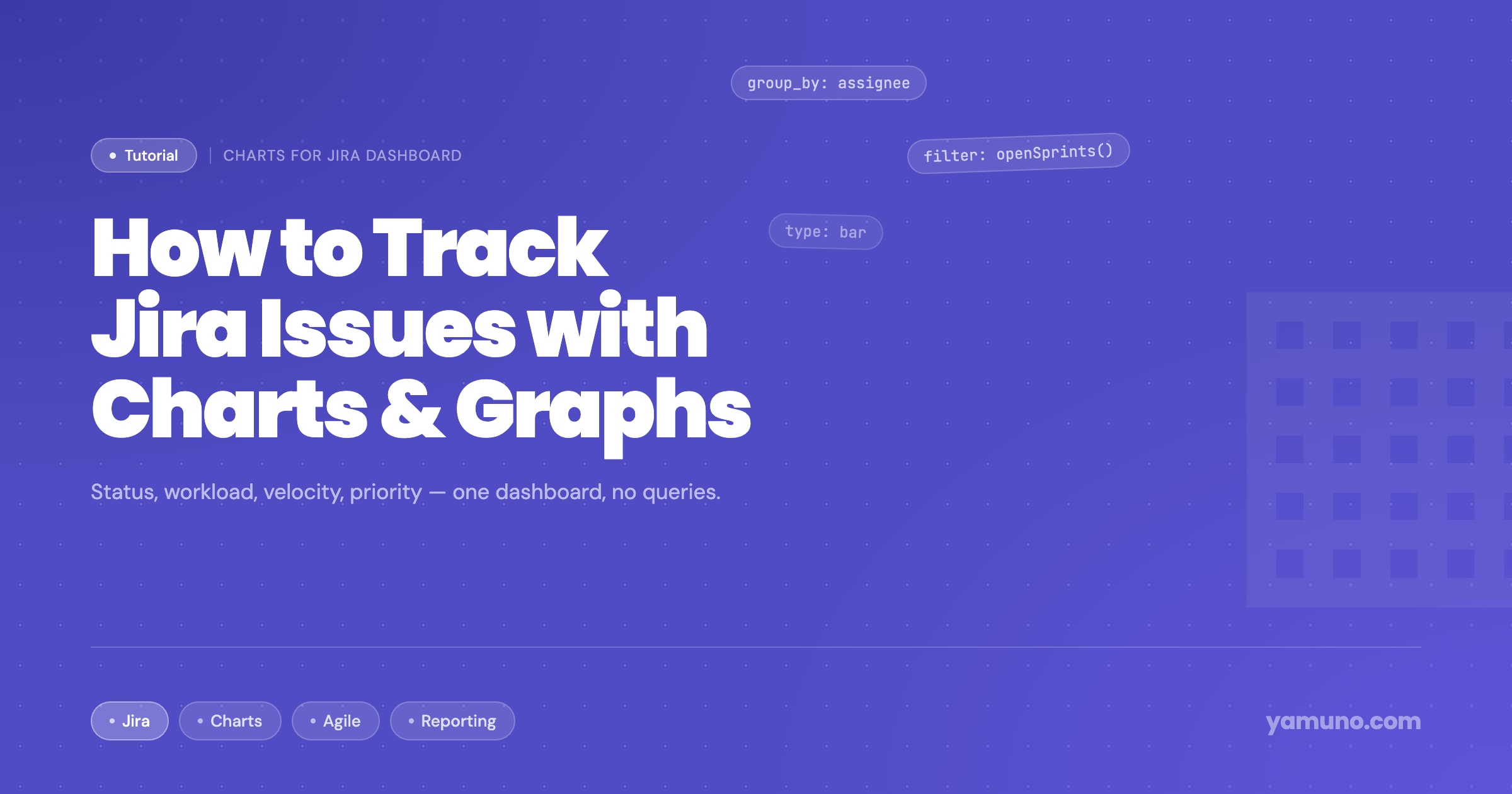
Jira's default reporting is useful but limited. Here's how to set up charts that actually help you track issue progress, workload distribution, and sprint health in one place.
Read more