By Yamuno Team
30 Jun 2026
6 min read
Jira stores detailed data about every issue — status, assignee, priority, type, labels, sprint, creation date, resolution date. The challenge isn't getting the data into Jira. It's getting anything useful out of it without building a spreadsheet report from scratch every week.
This guide covers the most practical chart setups for tracking Jira issues — what to visualize, how to configure it, and what to look for in the output.
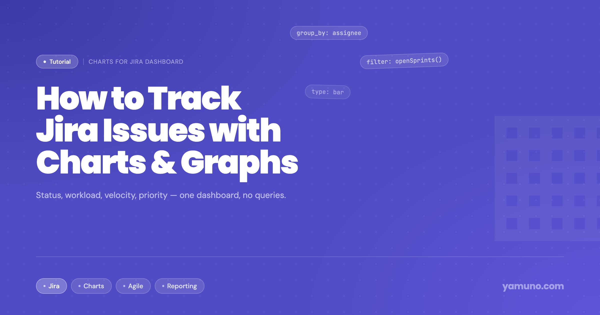
Charts - Reports and Graphs for Jira Dashboard adds chart gadgets to Jira dashboards. Install it from the Atlassian Marketplace, then add a gadget to any Jira dashboard by clicking Add gadget → Charts for Jira Dashboard.
Each gadget is configured independently — choose the chart type, data source (project, JQL query, or label filter), grouping, and visual options.
The most immediate question for any sprint or project is: how many issues are in each status?
Chart type: Bar (horizontal) Group by: Status Filter: Current sprint or open issues in the project
A horizontal bar chart with one bar per status — To Do, In Progress, In Review, Done — gives you the snapshot at a glance. When "In Review" is twice as wide as "In Progress," you know reviews are backing up.
For a kanban team without sprints, filter to "all open issues" and group by status. The relative bar lengths show your work in progress distribution and immediately reveal if one column is accumulating more than expected.
Chart type: Bar (vertical or horizontal) Group by: Assignee Filter: Open issues in current sprint or project
This chart answers the question that comes up in every sprint planning meeting: is the work actually balanced? One bar per team member, height representing open issue count.
The useful insight isn't just the current distribution — it's the pattern over multiple sprints. If the same one or two people consistently have the highest bars, that's a structural problem worth addressing, not a one-sprint anomaly.
Refinement: Add a second dataset for "In Progress" issues only (by adding a JQL filter status = "In Progress"). Now you can see not just who has the most assigned, but who is actively working on the most issues simultaneously — which is a better signal for overload.
Chart type: Pie or bar Group by: Priority Filter: Open issues in the project
A priority pie chart shows the proportion of Critical, High, Medium, and Low issues in your backlog. This is most useful for bug tracking and escalation management.
If you're watching this chart over time (check it at the start of each sprint), a growing "Critical" slice is an early warning sign that something in your triage process or product isn't working. A shrinking "High" slice alongside increasing "Critical" might mean labels are being inflated.
Practical use: Share this chart in your sprint retrospective. If the team sees that 40% of issues tagged Critical are consistently de-prioritized, the label is losing meaning — worth a conversation.
Chart type: Pie or donut Group by: Issue type Filter: Issues created in the last 30 days, or current sprint
Jira issue types (Bug, Feature, Task, Story, Spike, Tech Debt) tell you the composition of what the team is actually working on. If your roadmap says "feature development sprint" but the chart shows 60% bugs, you have a planning alignment issue.
This chart is most useful at the project or team level, not the sprint level — one sprint's composition can be an anomaly. The 30-day or 90-day view shows the actual pattern.
Chart type: Bar (grouped or stacked) Group by: Status Filter: Current sprint
A grouped bar chart with two bars — "Completed" and "Remaining" — is a straightforward sprint progress view. Set it up at sprint start and check it mid-sprint. The relative bar heights tell you immediately whether you're ahead, on track, or behind.
For a more nuanced view, use a stacked bar grouped by status: a single bar per sprint with segments for To Do, In Progress, In Review, and Done. This shows not just completed vs. remaining, but where the remaining work is sitting.
JQL for current sprint:
project = YOURPROJECT AND sprint in openSprints()
Jira labels are underused for reporting. If your team uses consistent labels — "customer-request," "regression," "tech-debt," "blocked" — you can build charts that filter to those labels.
Example: A bar chart filtered to label = "customer-request" grouped by status shows how many customer-requested issues are open vs. in progress vs. done. This is the chart that goes in a customer success update without you needing to manually compile a list.
Example: A count of label = "blocked" issues over time (if you're logging blocked state via label) reveals whether your impediment rate is stable or trending up.
A practical dashboard for a sprint team: three gadgets on one board.
| Gadget | Chart | Data |
|---|---|---|
| 1 | Status distribution (bar) | Current sprint issues |
| 2 | Assignee workload (bar) | Open issues, current sprint |
| 3 | Priority breakdown (pie) | Open bugs in the project |
That's enough to run a 15-minute sprint check-in without opening any Jira filters. Everyone looks at the same charts, asks questions from the same data, and the meeting moves faster.
Add a date filter at the top of the dashboard and make it the single control that drives all three gadgets. When stakeholders ask "what did we do last month," you change the date range and the answer is visible immediately.
Featured App
Visualize Jira issues with interactive, customizable charts and tables
Get product updates and tips straight to your inbox.
No spam, ever.

Sharing Confluence documentation with clients who don't have Confluence access is a common problem. Here's how solutions engineers and technical writers export polished, professional PDFs without manual formatting.
Read more
Confluence spaces accumulate attachments fast — and most of them are never referenced again. Here's how to audit, filter, and clean up attachments across your instance without breaking anything.
Read more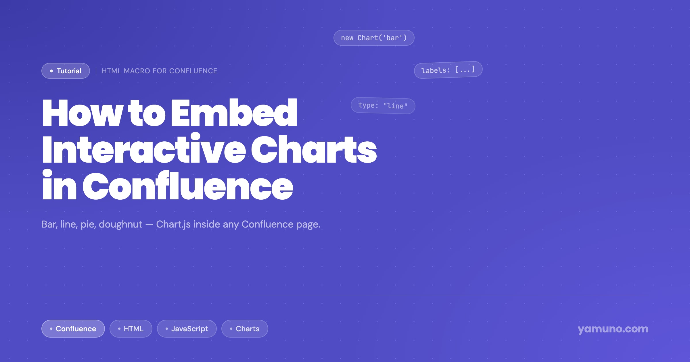
Confluence doesn't have a native charting macro. Here's how to embed fully interactive charts — bar, line, pie, doughnut — directly inside Confluence pages using HTML Macro and Chart.js.
Read more